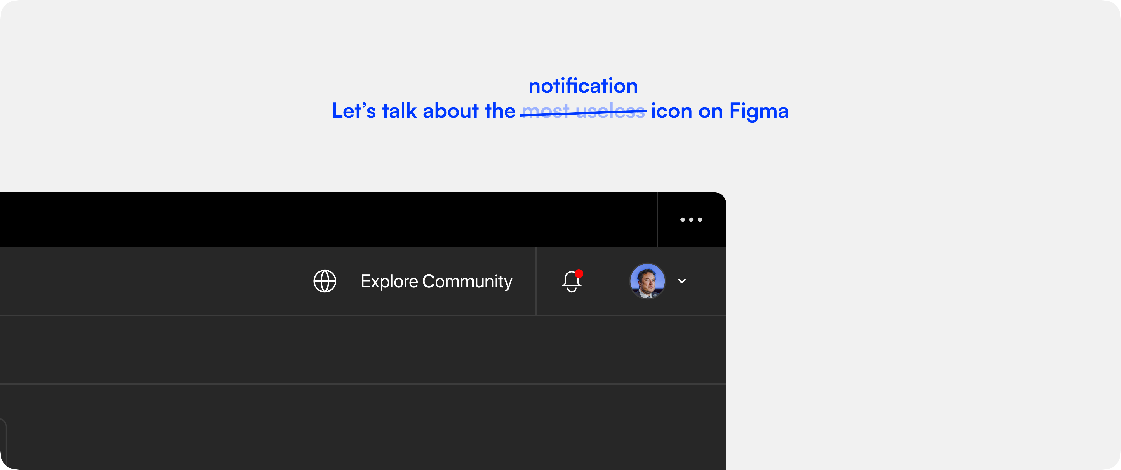
Everyday, I open up Figma and work on it for 6 hours at least, but there’s this icon on the top right of my screen called the notification icon that never really notifies me of anything.
It doesn’t show me what notifications I receive when I’m actively using Figma. Neither does it show me all the notifications I received while I was away to go touch grass

Why it mattered?
Now, there isn’t really an issue with this, but what if you were building a tool that had to be collaborative in an environment where speed of execution was super important? Something like Netflix trying to push out a promo today. You’d have to be fast.
Think about it, these guys work and trade their time for dollars. If we can reduce the time it took between one review cycle to another, we are not saving them money, we are literally making them money.
But, what we realised with our users was the same thing that any of us did with Figma notifications. Skip & Skim. It had one job: Notify you! and it failed day in and day out.
There’s a fine line between assisting a user and annoying them. Could we ground up notifications to an extent where we kept them more in the loop but only when required?
Notification - The Pillar of Collaboration 🤌🏻
A lot of the times we look at cutting edge collaboration and think real-time cursors moving around, instantaneous chat threads without sending and huddle, but real-time collaboration has existed for a long time with notifications.
Where was this needed the most?
While we looked at how users generally interacted with the notification bucket and the notification icon in general we figured,
-
Active users rarely missed the notifications that popped up as and when there was one.
-
On the other hand, the Inactive users when they returned to activity would see 7+ notifications on average and choose not to open it up right away and push them on for a later time in the day.
What we tried achieving
- Understand what user behaviour meant that the user has turned Inactive
- Account for all their unread notifications from before inactivity.
- Account for all the notifications received while they were away.
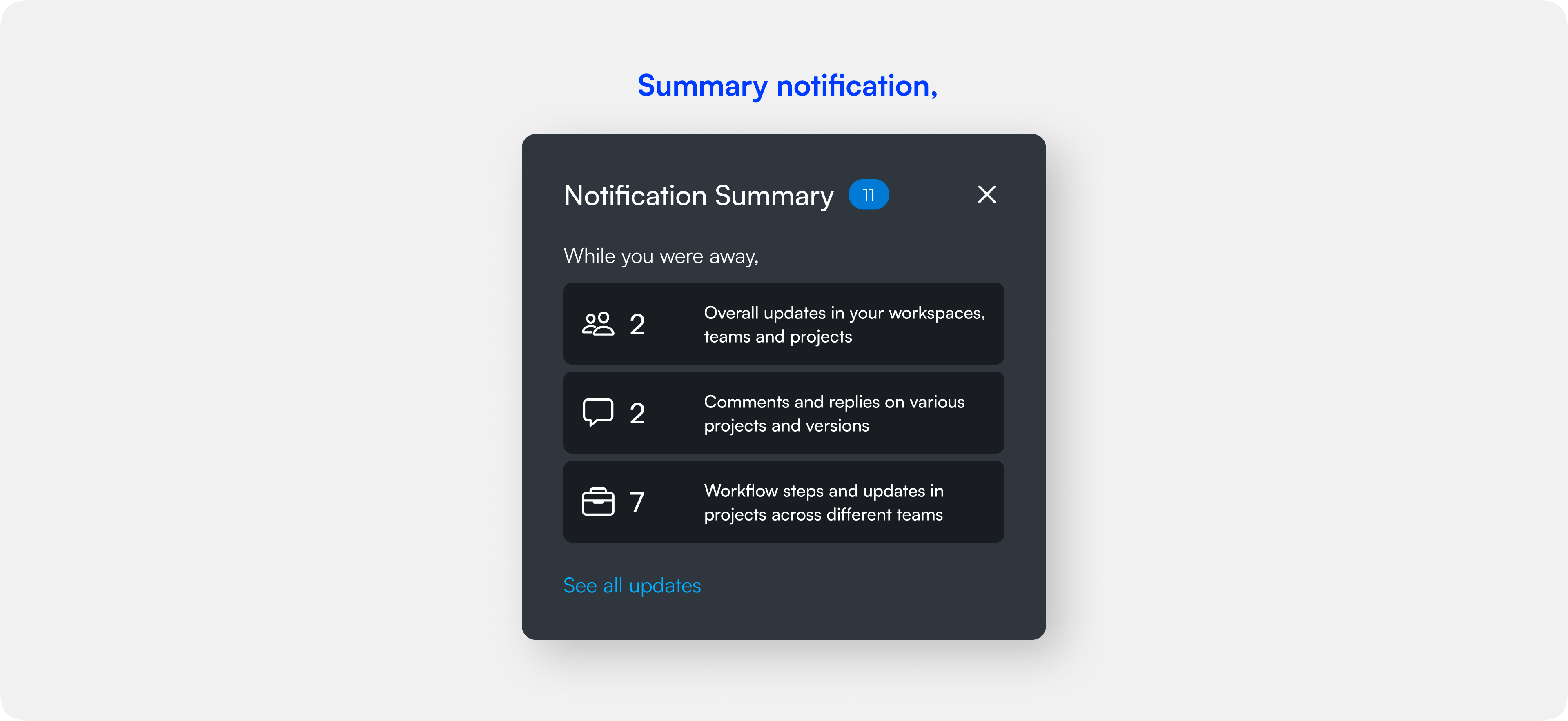
- Find the best way to summarise the different types of notifications that the user received.
- Understand when the user resumed to activity.
- Deliver the summarised notifications in an non-intrusive way and encourage them to look deeper into them.

How’d we go about this?
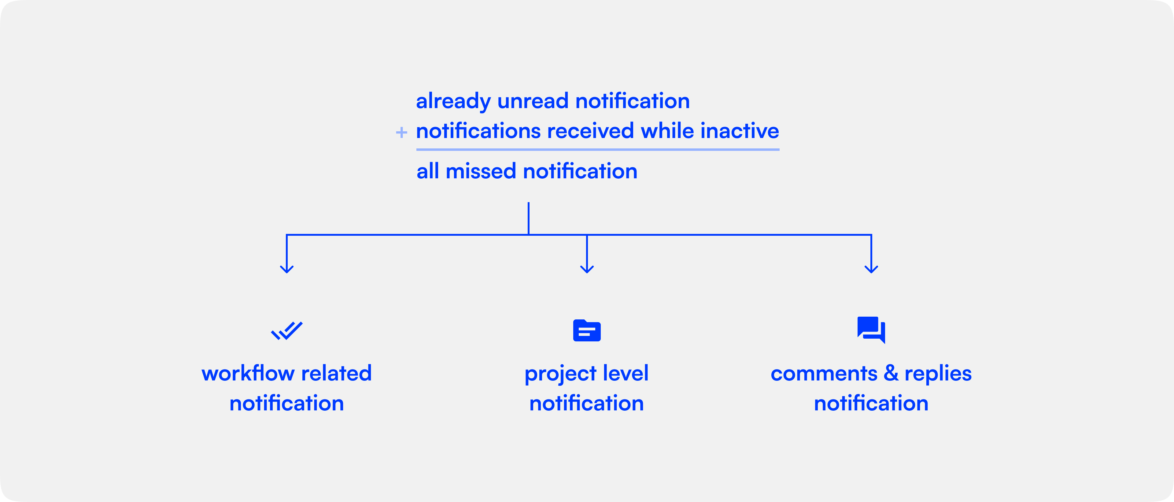
The first step towards enabling summary notifications was to account for all the types of notification that a user can receive and group them in a sensible manner. For us, this meant that we had 3 distinct types of notification: overall updates, workflow / project updates and async communication.

Once we had all our notifications grouped into each of these buckets, we wanted to create and deliver this information at the right time, which was crucial. You wouldn’t want a notification summary just because you were away for a couple of minutes, would you? But you’d rather not wait for a day for it pop up either. Lo and behold, we decided to deliver our notifications after 35 minutes? Why 35, you ask?

Research, as per link, says that on average Indian corporate culture accounts for 40-60 minutes of break for lunch and it’s divided between Noon-1pm and 1pm-2pm slots. Accounting for any inactivity for 35mins is the best time to avoid giving them summarised notifications too often but also make sure that the feature at least reaches them once a day, during lunch.
Executing the Experience - when design meets tech 🤌🏼
Real user experience is built not by beautiful screens or intricate UI-animations but when there are engineers who’ll go the extra mile to figure out what’s the best way to build a certain flow. One such engineer I’m fortunate to work with everyday is Nitin Ranganath, I’ll let the tech explain the tech and not make a fool out of myself.
Before we jump into the engineering behind, here’s a quick note for the readers:
The code blocks you’ll encounter as you continue reading assume that you’re using React as the choice of your frontend framework. However, you could extend this same logic to any framework (or even no framework!) of your choice. At the core of it, everything is pretty much the same.
When is the user inactive?
The first engineering challenge that came up is to figure out when should we consider the user to be inactive. Is the browser being closed inactivity? What about when the user is idle on the page? Or maybe is the user being on another tab inactivity?
With quite a bit of discussion on this, we decided that the user will be considered inactive when they’re on a different tab for more than a fixed threshold of time, 35 minutes in our case. Okay, but how do we find out when this happens?
Sure, you could keep pinging your server every couple of seconds through a websocket connection to denote your activity, but we wanted to take a different approach to skip this whole ping-pong between our server and the app, we wanted a simpler solution.
How tech solved this
Figuring out the tech was easier than expected. Since we consider the user to be inactive as soon as they switch to a different tab, all we need to do is find out the timestamp at which the user switched to a different tab. And when the user would come back to the app, all you need to do is figure how much time has passed since they had switched to a different tab.
Now luckily for us, we can tap into these events by listening for the “blur” and “focus” event on the window object in our browser. Every time the user would switch to a different tab, we would encounter the blur event. And when they would come back, we’ll get the focus event.
With just a few lines of JavaScript, you could write this logic. Here’s how we did it in React with our custom hooks:
useWindowEvent('blur', () => {
  console.log('Bye bye user!');
});

useWindowEvent('focus', () => {
  console.log('Welcome back!');
});
Unread notifications + notifications received during inactivity
Now that we have figured a way to detect when the user was away on a different tab, we would also want to note the timestamp at which this event happened. And what’s an easier way of storing this simple information if not the good old localStorage?
To get the timestamp, we can call Date.now() to get number of milliseconds elapsed since the epoch and store it in the localStorge. And with just a line of change, the event listener for blur event looked like this:
useWindowEvent('blur', () => {
  localStorage.setItem('LAST_ACTIVE', Date.now());
});
That was pretty easy, wasn’t it? With this in mind, the logic for when the user returns back to your app becomes pretty clear.
useWindowEvent('focus', () => {
  const lastActive = localStorage.getItem('LAST_ACTIVE');
  if (lastActive) {
    localStorage.removeItem('LAST_ACTIVE');
    const diff = Date.now() - lastActive;
    if (diff > 1000 * 60 * 35 && unreadNotificationsCount) {
      setShowSummaryNotification(true);
    }
  }
});
Let’s break this down line-by-line. First thing that you’d need to account for is if the LAST_ACTIVE timestamp even exists in your user’s localStorage. If this your user’s first time using this feature, they wouldn’t have it.
But let’s assume that the user switches the tab and comes back after a while. We’re inside the if condition now. Now that the user is active once again, it’s time to remove the old LAST_ACTIVE timestamp from the localStorage. To know how long the user was inactive, you can generate a timestamp when the focus event is emitted and compare it with the LAST_ACTIVE timestamp with simple subtraction.
Note that the result would be in milliseconds, so be sure to account for that. Finally, just check if the time different is greater than whatever threshold you want. But additionally, you should also check if your user actually received any notification while they were gone, so that you don’t deliver an empty summary notification. That’s precisely why we’re checking for the unreadNotificationsCount in the above piece of code as well.
Summary how?
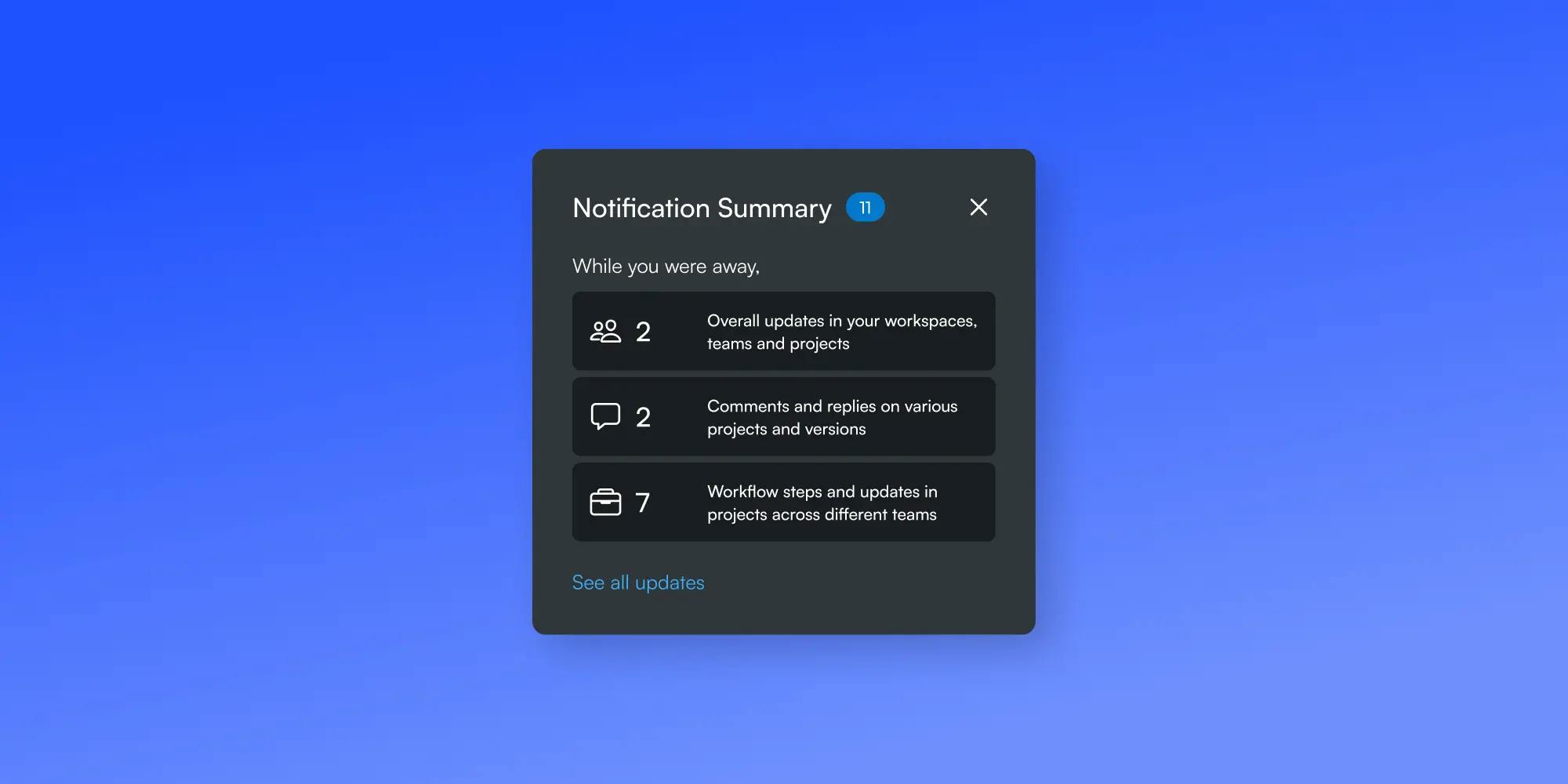
While we have already solved for sorting of the different types of notifications into three macro categories, this was fairly simple to accommodate into a popup right where the user would usually view notification.

That’s all folks!
As you read this we are shipping 📦 this to our active clients and we hope to reach our success metrics, follow us on twitter for more updates, Akash’s Twitter and Nitin’s Twitter.
You can take a look at our company Tessact.com
